I redesigned the in-product upsell experience to make upgrade paths more transparent, contextual, and personalised, driving a 45% increase in upgrade conversion and creating a smoother path from feature discovery to checkout.
Client
PandaDoc
Industry
B2B SaaS
Role
Product Designer
Timeframe
Late Q1-Q2 2025

Self-serve expansion revenue through add-on and plan upgrades was underperforming.
Minimal % of total expansion MRR came from feature-based upgrades (vs. seat expansion)
<2% of users who saw upsell dialogs completed an upgrade
Upsell dialogs were generic, unclear, and inconsistent across 29 features
Checkout lacked connection to user intent or value clarity
Goal: Increase conversion rates from upsell prompts and align them with real user intent.
Research and insights
Through user interviews and feedback, several key insights emerged:
Scroll for more insights →
I redesigned the entire upsell flow from encountering the paywalled feature, to the checkout experience, focusing on clarity, contextual value, and personalisation.

Before
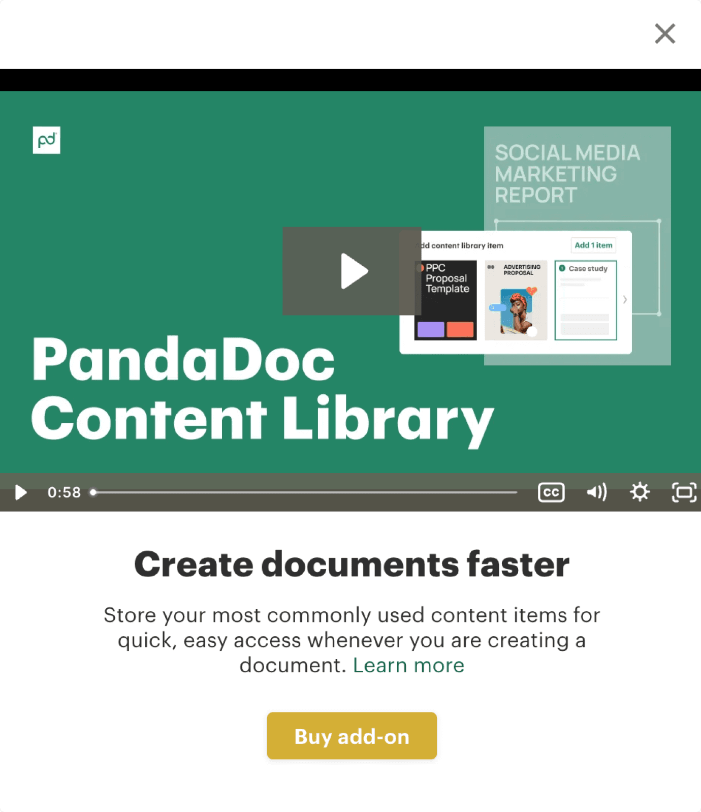
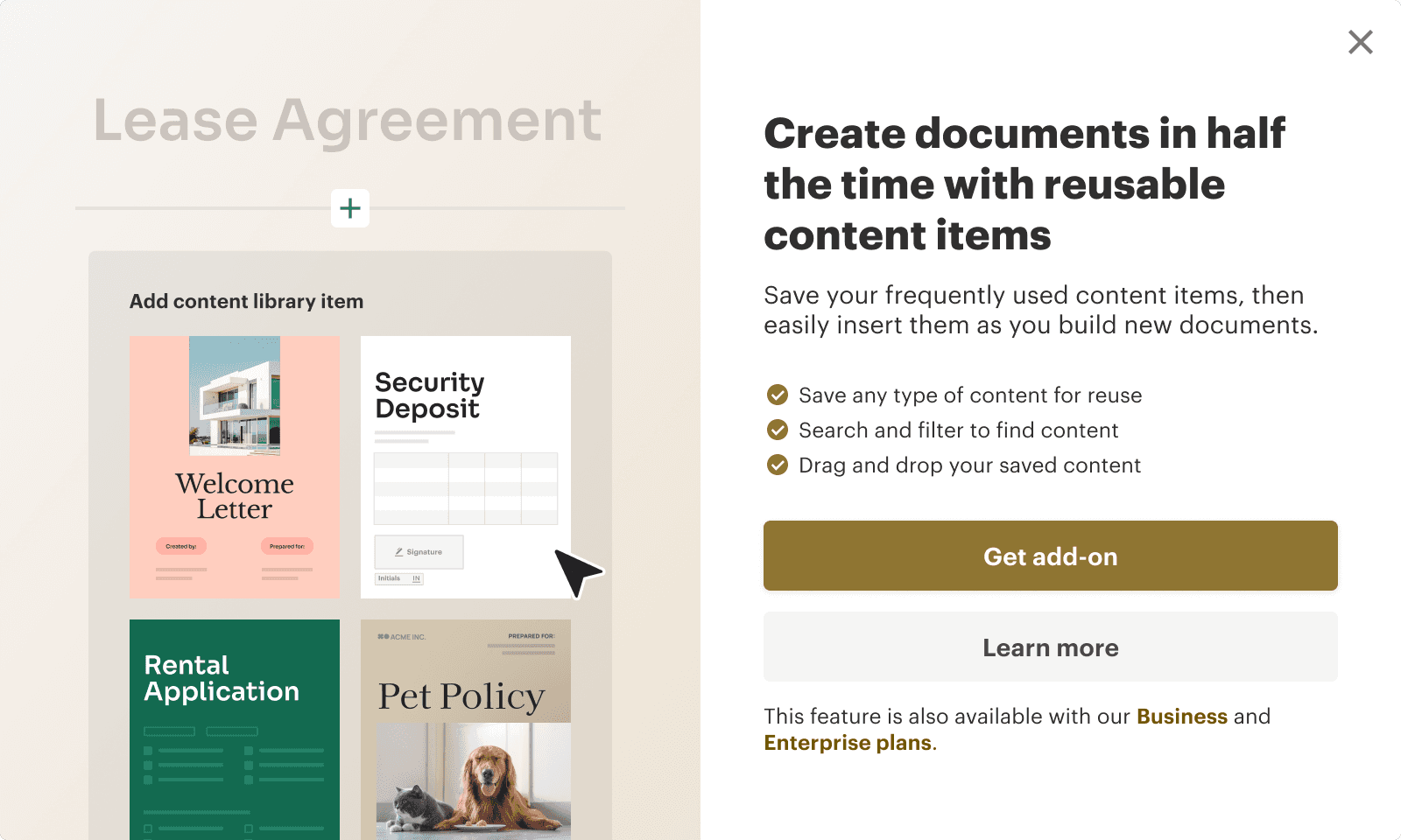
Generic dialogs with inconsistent visuals and content. No pricing clarity and little diffrention between upgrade and add-on paths.
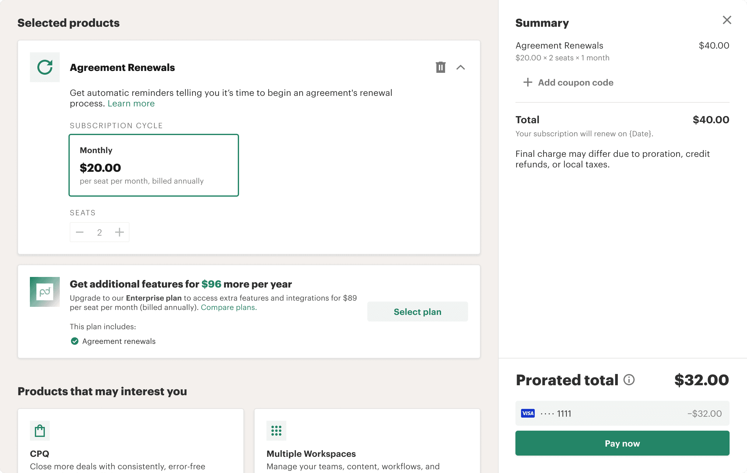
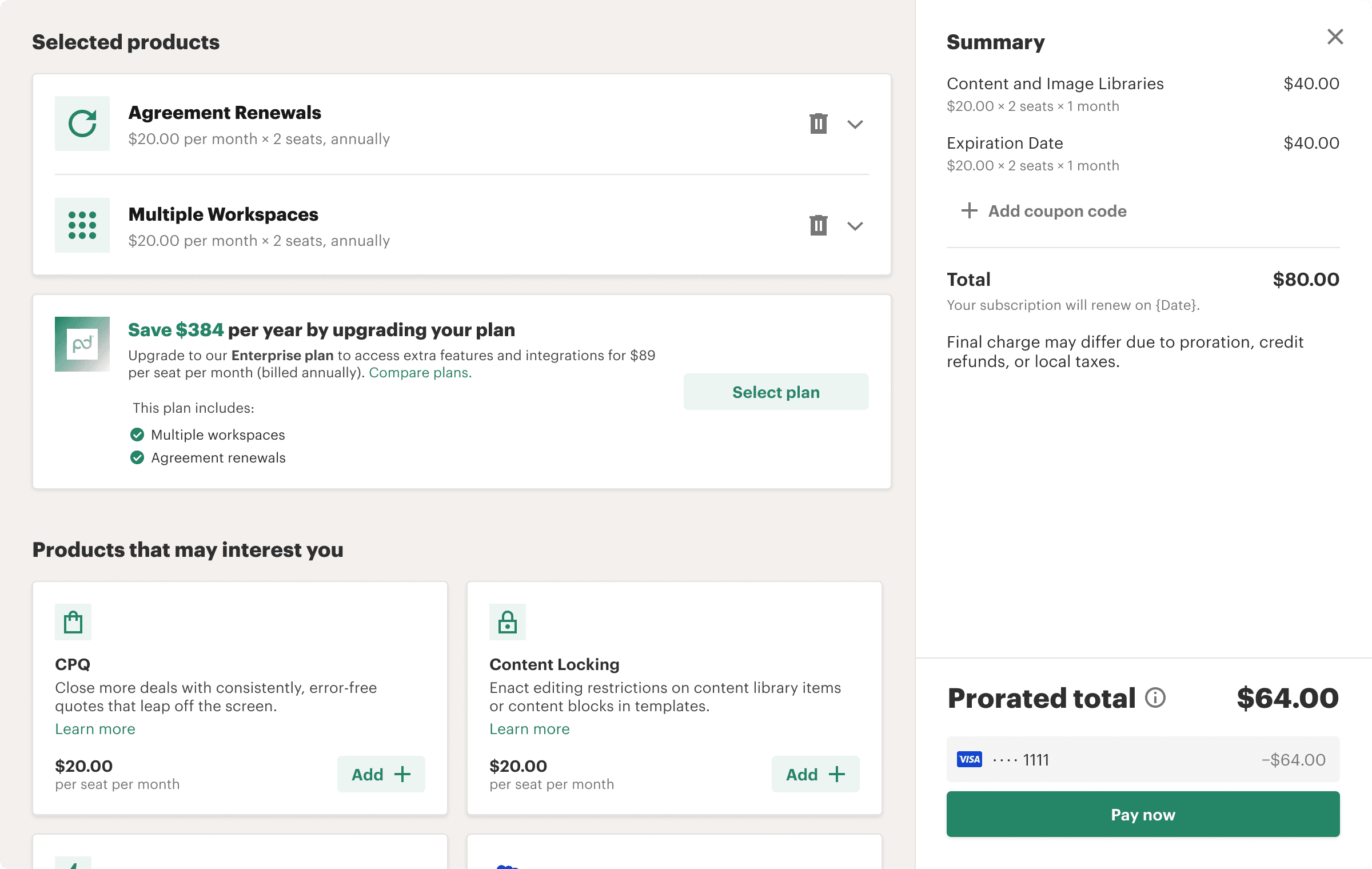
After
`Two dialog types based on intent:
Plan Upgrade Dialog
Clear value prop of the feature
List of 5 related features included in the higher plan
Secondary CTA: “Learn more” (links to feature page)
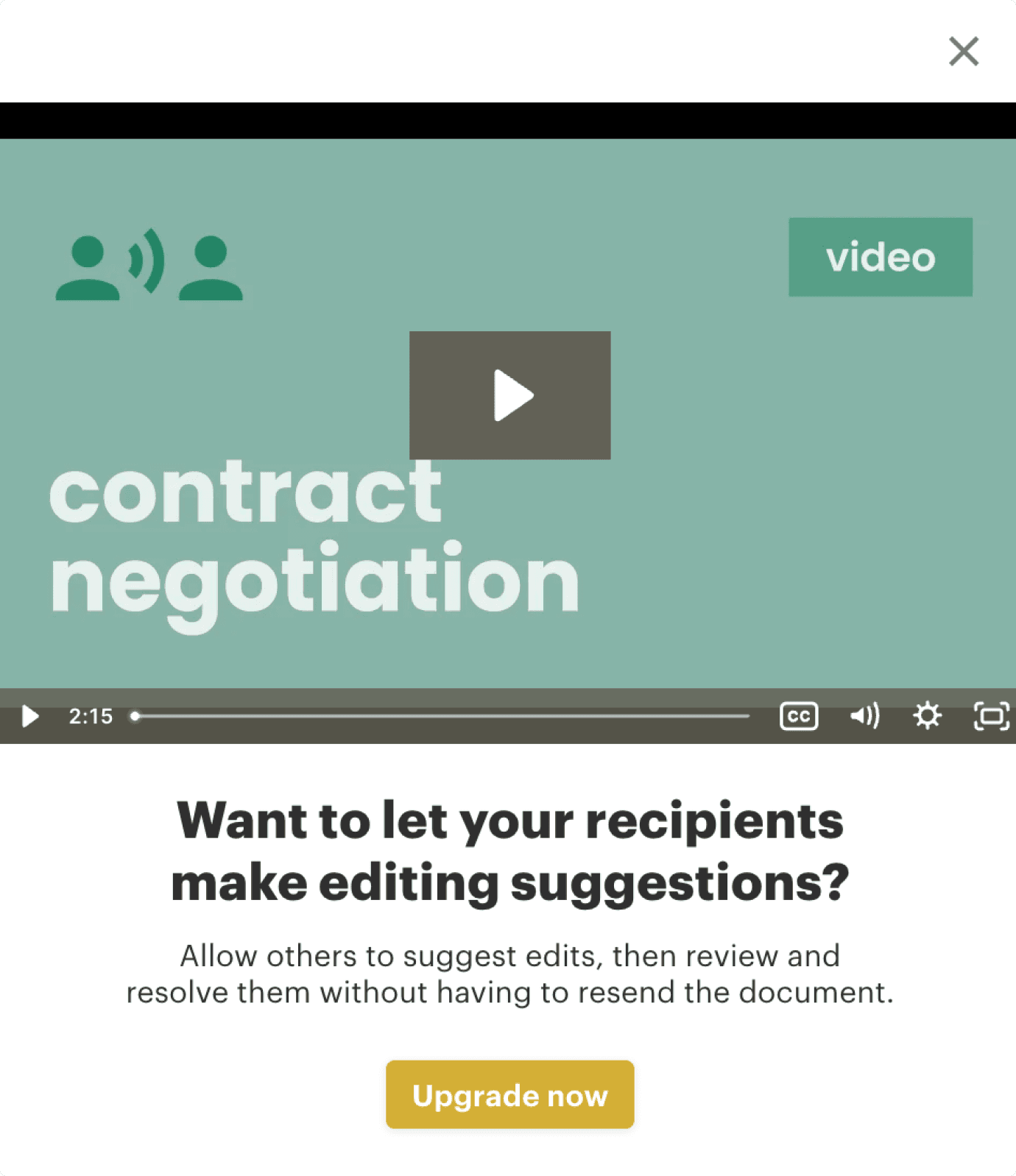
Add-on Dialog
Singular focus on one feature
Headline + 3 concise benefits
Copy gently notes that the feature is also included in Plan X
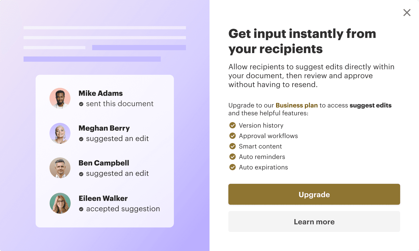
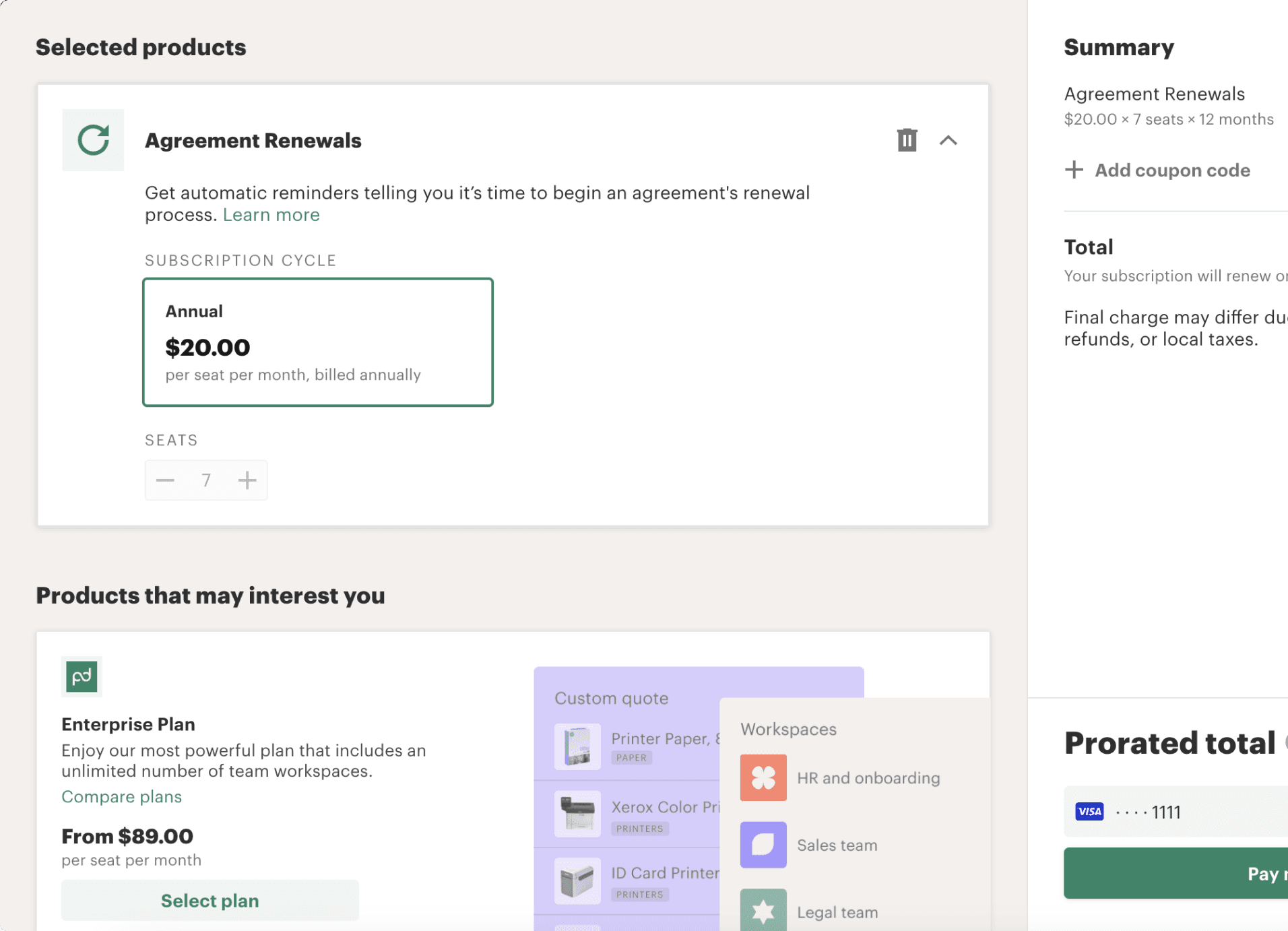
Before
Upgrade checkout dialogs didn’t highlight the feature the user navigated there from
Upgrade recommendations felt generic and price-driven
Solutions
Feature Confirmation: Checkout now highlights the specific feature that brought the user here
Dynamic Plan Recommendation Module:
Compares total add-on cost vs. upgrading to the next plan
Emphasizes savings and bundled value
Auto-updates based on cart contents and current plan
Helps migrate users to annual plans for churn reduction
Cross-functional Collaboration:
Team
Contribution
Product Management
Prioritised pricing and trigger logic
Engineering
Implemented dynamic checkout logic
PMM
Developed value propositions, headline and CTA copy
Marketing Design
Created new visuals and animations based on my briefing
Even without showing full pricing in the dialog (due to technical constraints), the clarity of value and strategic timing drove significant lift.
I led a broad scope of work for this project, owning it end-to-end and ensuring all edge cases, user types, and environments were fully supported.
Use cases covered
I mapped the full ecosystem of scenarios in which upsell dialogs could appear, including all entry points, subscription states, and user roles. This allowed me to ensure button labels, messaging, and calls-to-action were consistent and contextually accurate.
I also redesigned the flow for non-admin users requesting access to premium features by triggering a tailored email to the account admin, improving clarity and reducing friction around feature access.
Responsive design
Although PandaDoc is predominantly a web-based platform, I ensured that the dialog system worked seamlessly across mobile breakpoints by adjusting the layout and collaborating with the marketing design team to request mobile-optimised assets.
Accessibility improvements
During the audit of the existing monetization patterns, I identified that the UI color used for premium features did not meet accessibility standards and failed contrast checks. I updated the premium colorway and ensured every combination met AAA Web Content Accessibility Guidelines (WCAG) for contrast.
Guidelines
To streamline asset creation and maintain visual consistency across the product, I created an initial set of visual guidelines for premium feature presentation. The marketing design team refined these into a final set of shared guidelines used across the wider UX and product teams.
Key learnings
Users respond to timing and relevance, not repetition
Micro-copy + pricing cues can drive action faster than visuals or video
Feature-first messaging creates a better mental model than plan-first framing
Collaborating across Product, PMM, and Marketing Design led to a cohesive, on-brand experience


