End-to-end lead on the development of a new resale product offered by Reflaunt that enables fashion brands to facilitate the exchange of customer’s pre-loved items with store credit.
Client
Reflaunt
Industry
Resale-as-a-Service
Role
Product Designer
Timeframe
3 months
Context
Reflaunt is a tech startup with a mission to make resale part of every shopping experience.
To achieve this, Reflaunt partners with fashion brands and retailers to provide B2B2C digital products that enable said partners to enter the resale market.
The Problem
Launching peer-to-peer resale channels with Cos, Axel Arigato and Ganni had proven customers were interested in purchasing second-hand items direct through the brands. However, there were challenges and lessons already learnt.
A number of logistical issues were raised that made it difficult to compete with existing platforms such as Vestiaire and Vinted. The clients were also reluctant to allocate marketing budget and traffic away to an additional e-commerce platform. Reflaunt also wanted to invest it’s efforts in acquiring higher value items for greater margins.
It had become apparent a new product was needed to better facilitate the business goals.
Be able to engage with the resale market in a way that is low investment and low risk
Increase brand loyalty by encouraging customers to repurchase with them
Gain some level of control of their second hand items
Reflaunt:
Access to high quality inventory from luxury brand’s customers
A solution that is scalable to more fashion brands and retailers
Generate value from unworn pieces of clothing
Quick and easy process: don’t want to spend time photographing items or waiting for a sale
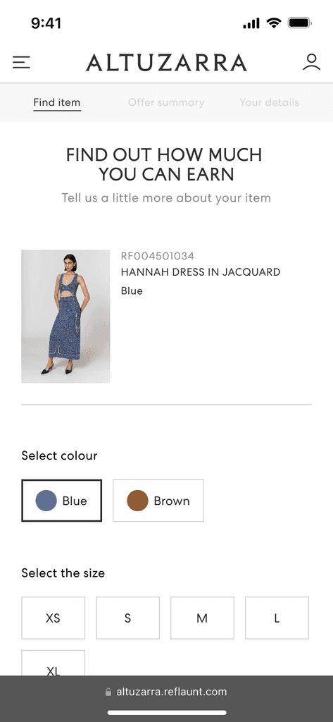
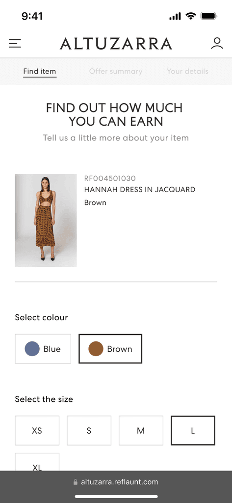
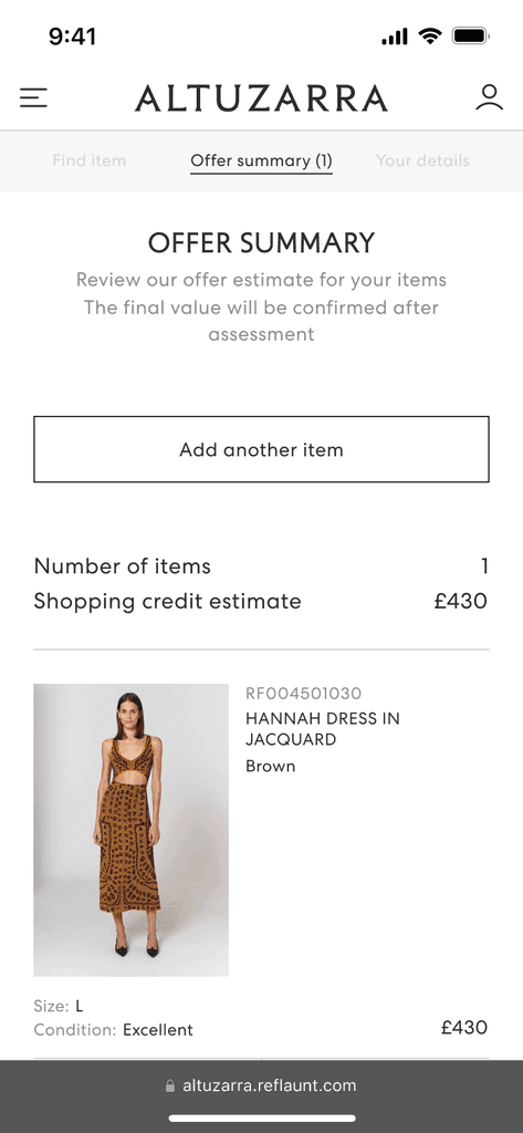
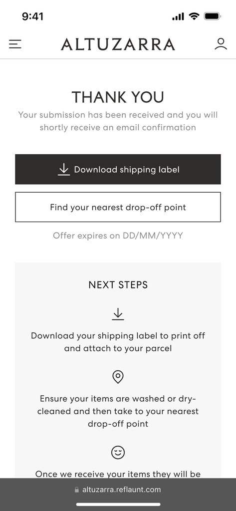
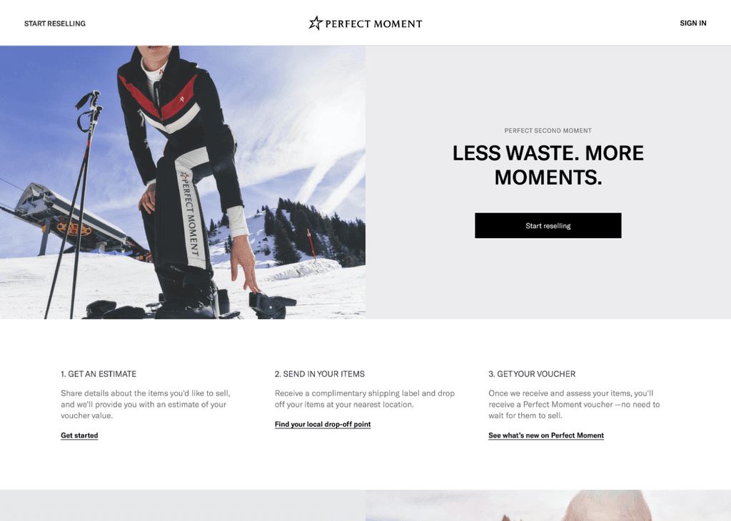
A platform that enables the customers of the brand to exchange their pre-loved items for store credit. The brand can then resell those items on a dedicated second-hand section of their main e-commerce website.
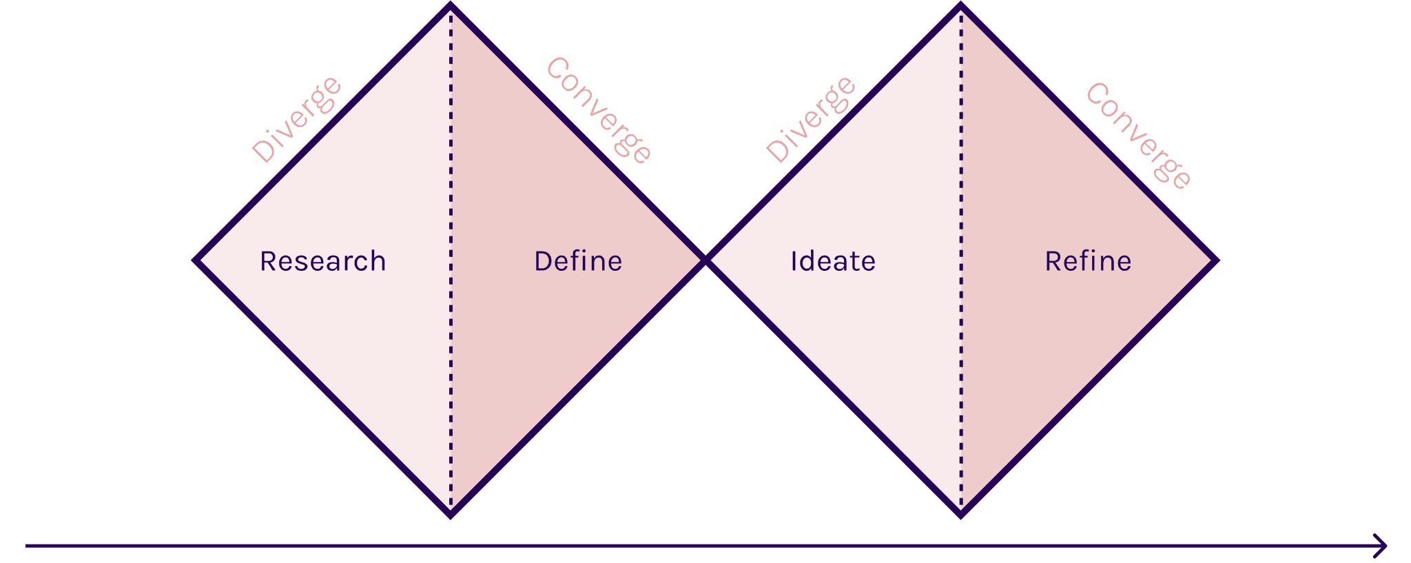
As Lead Product Designer, I was part of the full design process, beginning with research to delivery of the final designs to developers. This included writing UX copy across all touch points. Additionally, I was responsible for communicating with the clients for design walkthroughs and gathering feedback. For this I took the double diamond approach, combining convergent and divergent stages.
I began with a competitive analysis, where I collated research on similar products currently available. I looked to wide a range of examples, from competitors providing white label resell solutions to technology retailers offering trade-in services. I made note of the features used and reviewed the user journey. I listed the strengths and weaknesses of each and put together a summary of my observations. Below is a sample of some of the competitors analysed.
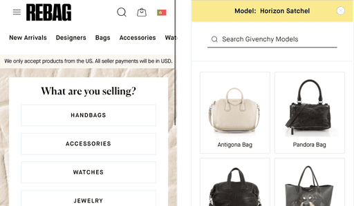
Rebag: Bag trade in
Pros
Images of models and materials help find product quickly
Very easy to navigate with ability to edit information at each step
Image recognition software a bonus
Visually consistent, using colour and texture to differentiate content and controls
Cons
Process tedious, took many steps before receiving value of item
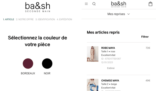
BA&SH: Seconde Main
Pros
Offer generated in only a few steps
Visual buttons for the item colour, size and condition makes the process quick and simple
Summary page is very clear what the next steps are with all the information present
Cons
No image to confirm the item code entered is correct, image isn’t seen until the summary page
Unable to edit the item on summary page requiring restarting to make a change
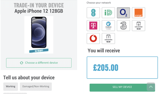
Carphone Warehouse mobile trade in
Pros
UI is clean but uses colour to add depth and differentiate buttons and information hierarchy
Search bar suggests results to speeds up finding the correct item
Can compare the different amounts to receive depending on the item chosen and condition
Call to action is clear and direct “Sell my device” helps to further the user journey
Observations
The next step was collating the research from the competitive analysis along with learnings from existing resell services offered (pain points, successes) – to define a list of requirements. I did this alongside the Product Manager, who created PRD documentation.
Discovery:
Requirement:
Ideate
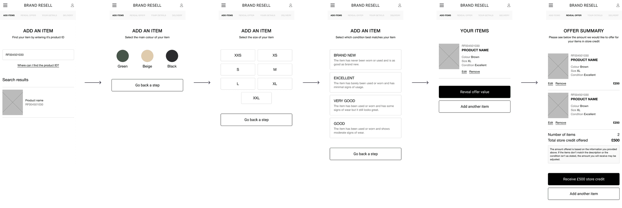
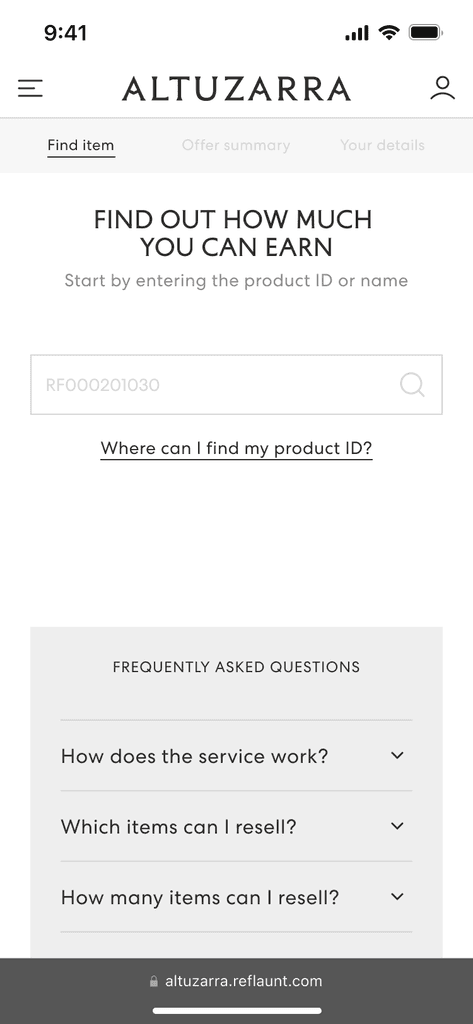
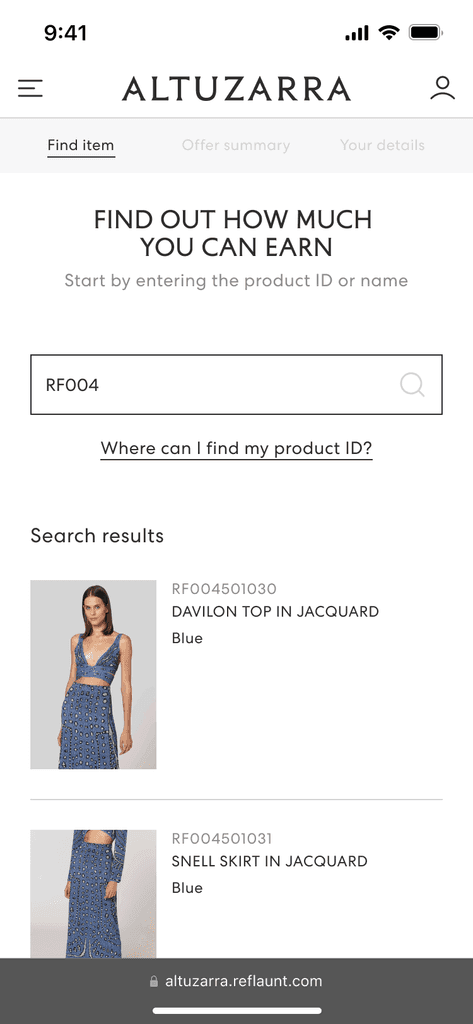
To ideate all of the ways that the product could work, I created a user flow diagram on Miro which I used to establish every step required. Through this method, I created lo-fidelity wireframes to explore the different ways the information could be laid out. I felt the versions I created that had visual cues for the variables were more engaging to the user and were easier to input than a standard dropdown form.
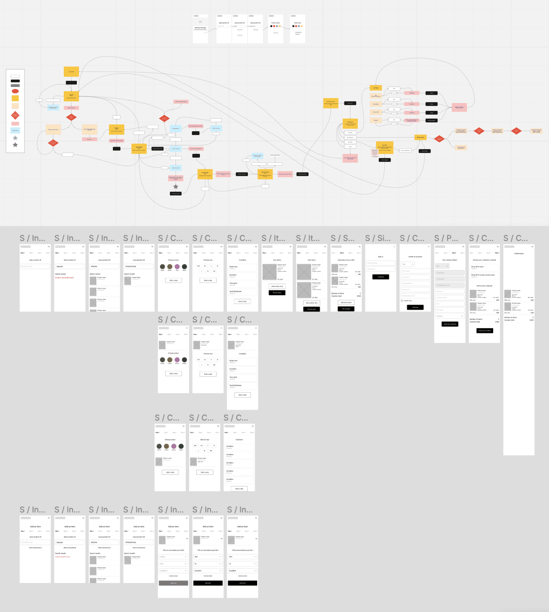
Taking the lo-fi wireframes, I filtered down to two options which I then created prototypes to understand which was the simplest solution to the problem.
Option A
In this user flow, a response is required on each screen before the user can continue to the next step, The UI uses visual buttons for each step to maintain engagement.
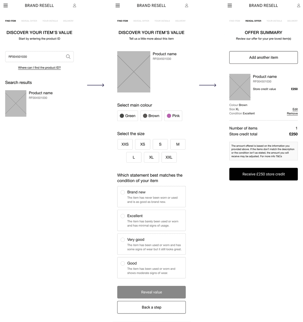
Option B
The key responses to generate an offer are kept on one page. The styling of the buttons are more consistent across each section.
From testing the two options with internal stakeholders, the preference was for Option B wherein all of the variables were shown on one page that made it easier for the user to add or change the information to reveal the estimated offer.
In Option A, the user would have to confirm all items they wanted to be resold before revealing the total offer. It was felt this could disengage users by showing the financial gains at too late of a stage.
Taking everything I had gathered so far, I built out the full user journey and created a high fidelity prototype. This was then used to undertake two usability testing workshops – the first with the internal team and the second with the first confirmed client for the resell service. I lead both sessions and walked the groups through each step and asked for feedback on the clarity of the proposition and the general ease of use.
Insights & Takeaways
I gathered this feedback and further iterated on the designs. The workshops also gave valuable insights into the kinds of questions customers may have at each stage of the journey and these were taken into account when developing a dynamic set of FAQs on each step. Additional features such as using AI to detect the exact item from a photo or filtering would not be possible for MVP but could certainly be considered for a 2.0 development when the product success is validated.
Taking the learnings from previous product launches, we knew that Take-back should be highly scalable to allow for faster development and scope for continuous improvement as each client is signed. To ensure this, we agreed from the outset that there would be a set user flow in which all Take-back products would follow with limited number of UI edits per brand. I defined with the engineering team the parameters at which we would change, balancing out scalability with providing a branded experience.
Design System
I had this in mind when developing the UI and taking my previous experience working with design systems of other fashion brands to build out a design system that was clean, modern and user friendly while easily being adaptable to different style guides. I tested implementing different brand identities into the design to see whether the design felt cohesive to reach the end result.
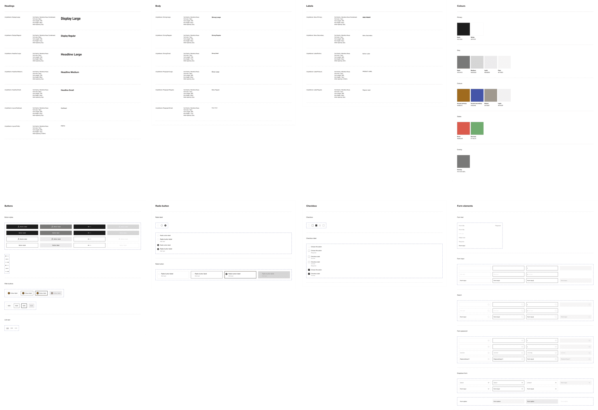
Above
Some of the design system components I created.
Brand User Guide
Using the defined parameters for brand customisations, I put together a branding and design guideline deck to send to signed clients. This would guide the brands into providing suitable assets and information so that their brand identity could be implemented.

Above
Sample slides from the guideline deck shared with clients
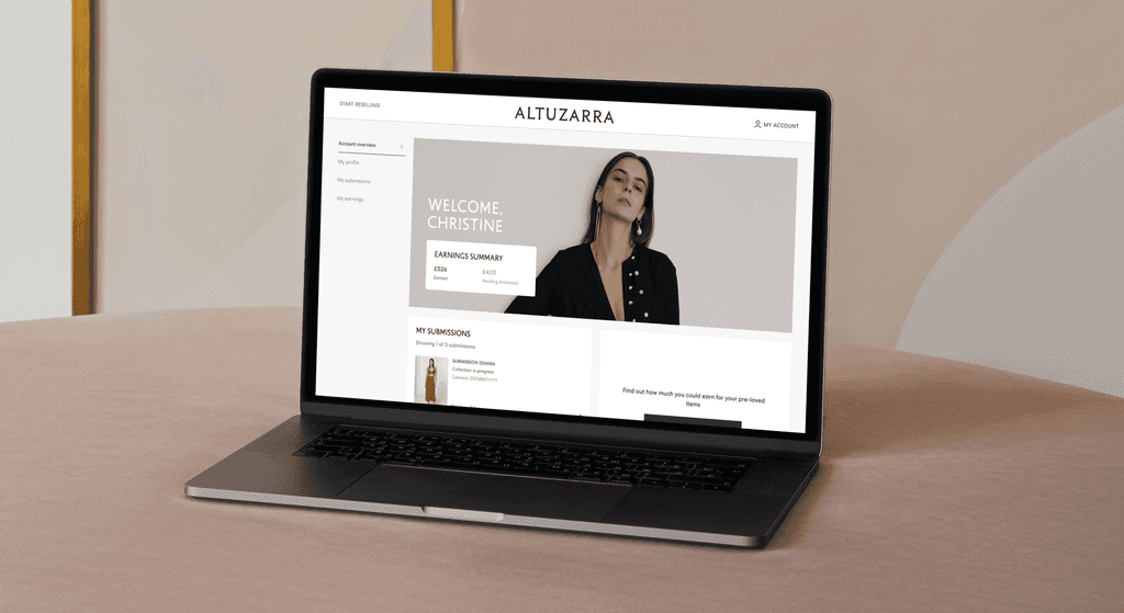
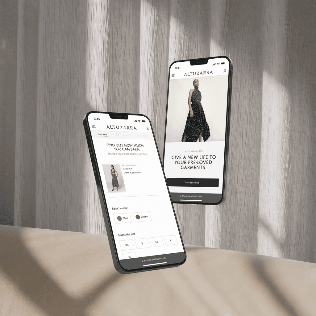
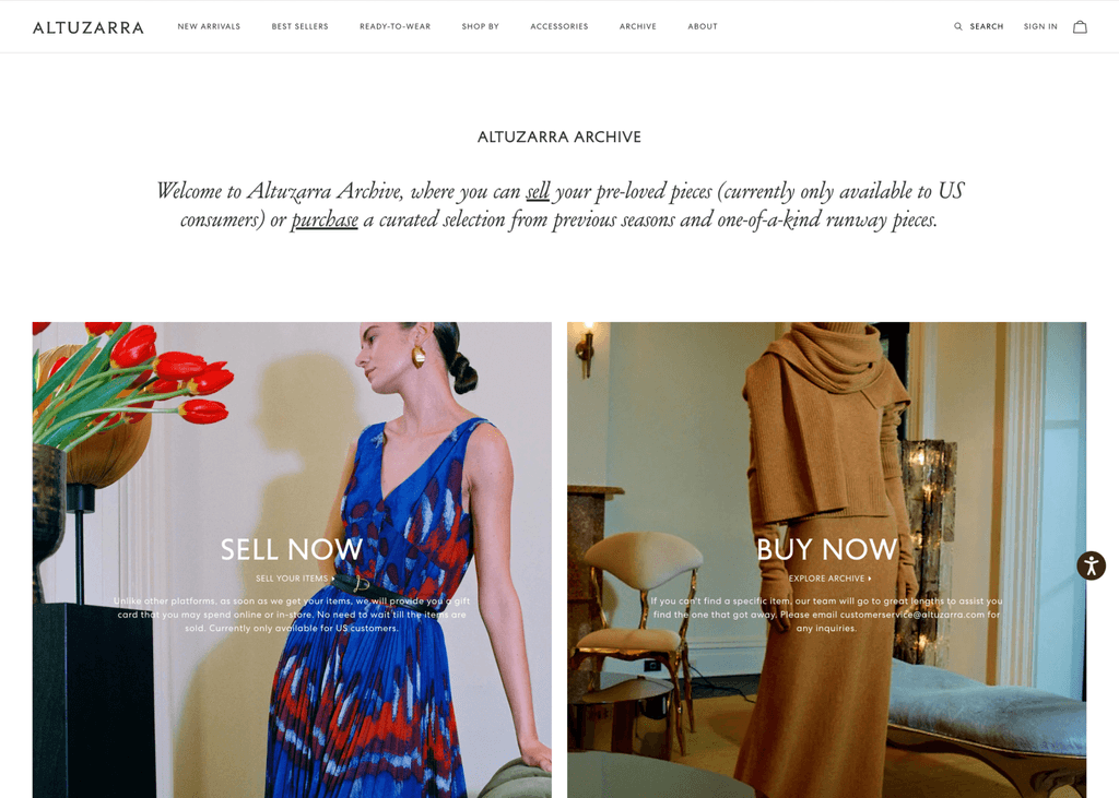
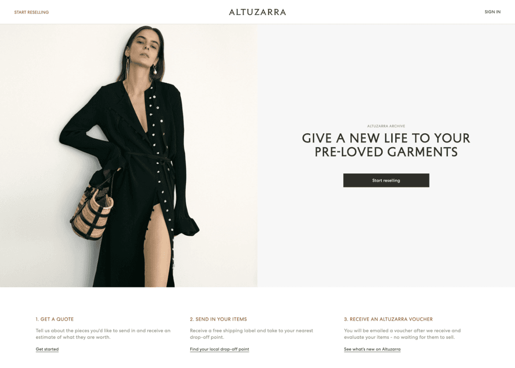
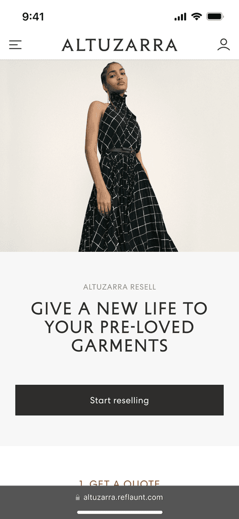
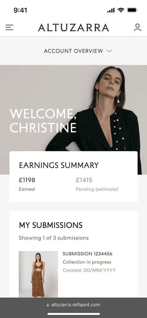
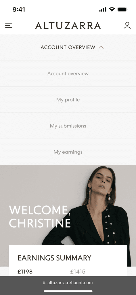
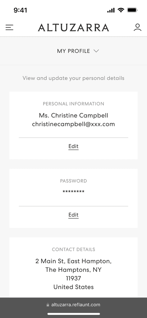
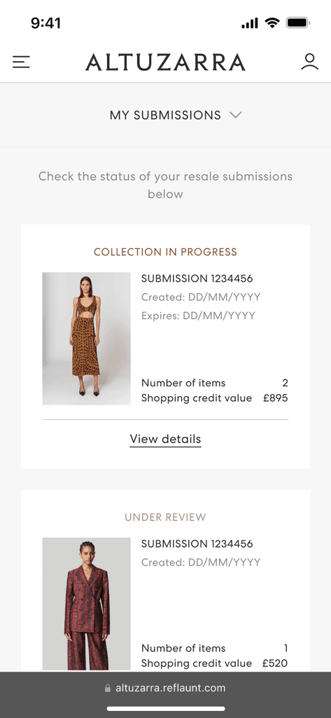
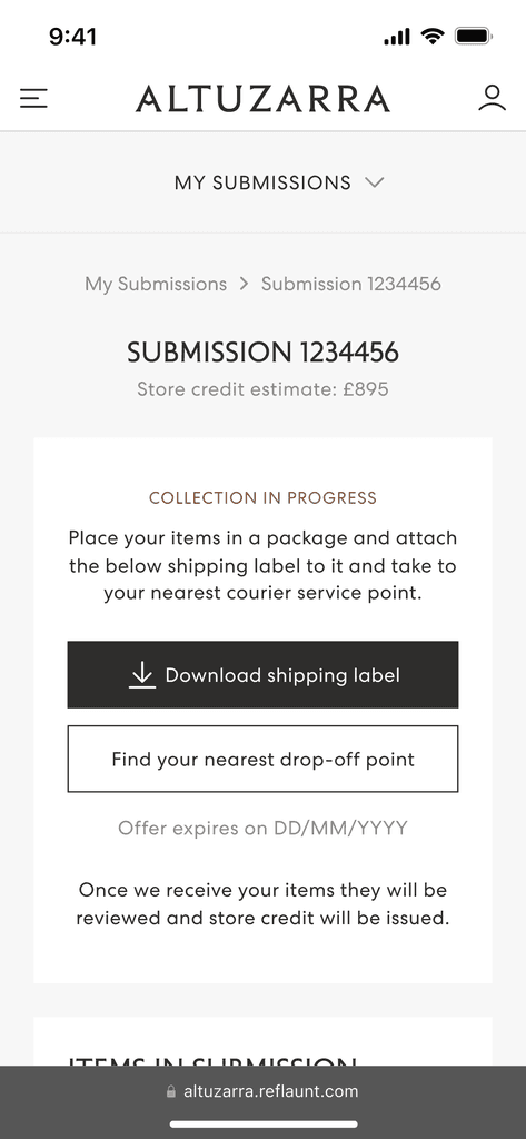
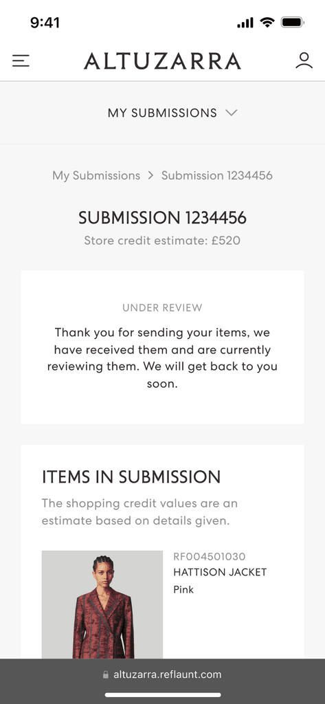
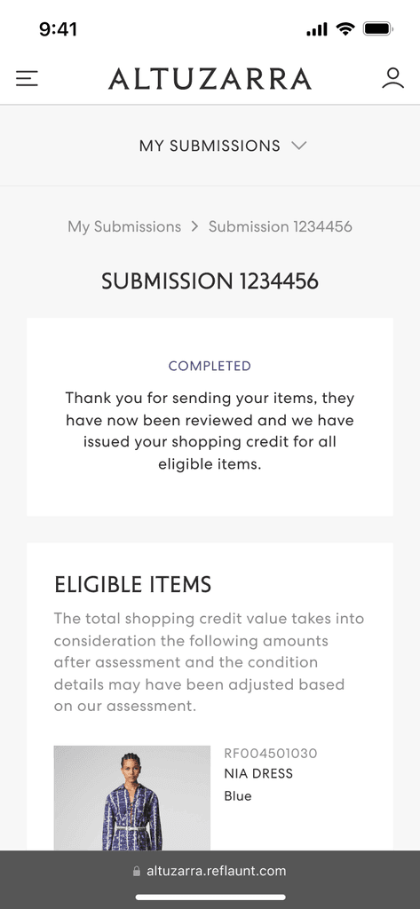
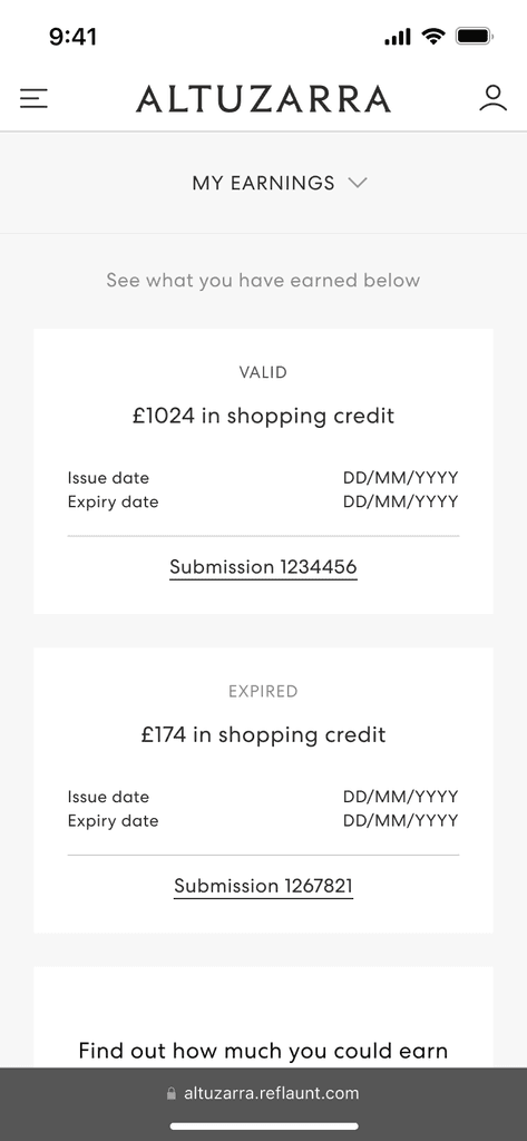
In late 2023, Reflaunt launched the Take-back product with it’s first client, Altuzarra. The brand created a section of their main website dedicated to reselling named Altuzarra Archive where the customer is able to shop pre-loved items as well as access the Take-back service through and external link.
With a second client in the pipeline, the engineering team was able to simultaneously develop both websites using the design system I created. To date, this was the most rapid development time for any Reflaunt product launched and set the benchmark for ways of working going forward.
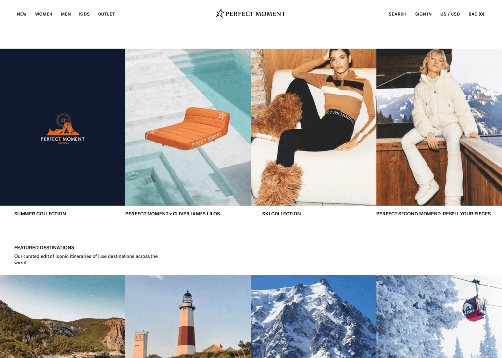
In 2024, Reflaunt launched the same resale service with Skiwear brand Perfect Moment. Applying the same process they were able to launch the product within 4 weeks making it Reflaunt’s fastest turnaround time.
With the success of the product launch, Reflaunt saw further opportunity to improve the scalability of its other resale products and decided to apply the same process and parameters that I defined to rapidly improve launch speed and acquire even more clients.


